Welcome to the birth of a new Special Feature! Since I’ve already said that the reconstituted GMC isn’t going to depend too heavily on the old Special Features I thought I’d fudge a little by adding a new one, and what better time to do it than the start of a new year? Also, since my New Year’s resolution is to continue being cantankerous, it only makes sense to use it to kick off the new Special Feature I’m calling the Squeaky Wheel.
The simple fact is that I’m a proud curmudgeon. I like to spout off about things that annoy me, offer my opinion on matters that I’m completely unqualified to judge, and give unsolicited and questionable advice to anyone who comes along. But while I’m grumping and complaining maybe I can occasionally shed a little light into some dark corners.
Today I want to grumble about something that might affect a lot of people: the readability of websites. I’ll confess right up front that my eyes (along with a few other parts) aren’t what they used to be, but I have noticed over time that a lot more websites seem to have adopted a softer style that is harder to read. You might not have noticed but what used to be mostly sharp text on a contrasting background has gradually morphed into a style that features a lot of thinner, softer text that’s sometimes even sort of grayed-out. Of course users can always press CTRL+ to make it bigger, and the browser will remember it so it will be that way for you next time too. (A neat trick that you knew about, right?) But sometimes that will distort the page and hide some content, and it’s annoying to have to keep enlarging every new iffy website you run across.
When I recently redid the GMC I took a lot of time to choose a new theme that would have all the features I wanted while also allowing me a wide choice of fonts, because I was determined to make it as readable as possible. I then picked the boldest font and in a size that I thought would be very readable, and I think it turned out pretty well. I hope that’s true for everyone reading this but as for me — always tinkering — I still wasn’t completely satisfied, because even if the GMC looked pretty good there were a lot of other websites that didn’t. So I went one step further and discovered something that really improves readability, and I thought I’d pass it along for what it’s worth. I found a browser extension called Gray Font To Black Font. Below is how the GMC looks with and without the extension.*
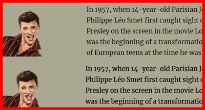
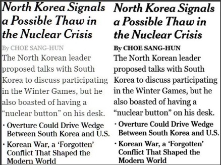
Hopefully you can see the difference and on some websites it’s even more pronounced — remember I’ve already got the GMC pretty well set up even without the extension. Here’s a better example, from a website that’s always been problematic for me:
I should mention that this is a Firefox extension. I know a lot of folks use Chrome and it has a couple of similar extensions, but I could never get them to work very well when I was a Chrome user. A little history — after many years with Firefox I switched to Chrome a couple of years ago because Firefox had gotten too slow and sluggish. But recently I tried the new Firefox Quantum and not only was it faster but it also had some other things I liked. In addition, it seemed a little sharper and clearer than Chrome and it offered Gray Font To Black Font to make it look even better, so I happily became a Firefox user again.
If you want to try the extension yourself you should know one other thing about it. It works fine with 95% of websites, but you will occasionally see one that doesn’t seem to play nice with it. No problem because you can just enter the website’s URL as an exception in the extension’s ‘Options’ and it will be fine. And just for the record, I don’t have any connection to the extension’s author or get any kind of benefit from recommending it (or Firefox Quantum) except knowing that I’m passing along info about something that does what it says it will do. What more can you ask from a Squeaky Wheel?
* Background has changed since this was written – see comments below.

Thanks for the tip. I’ve had that gray type problem for a long time. A related problem is the lack of contrast between the text and the background. Often they like to put light gray type against a white background. Or dark type against a dark background. It may look great but it becomes almost unreadable for many of us. Have you tried a lighter background color on this website? Happy New Year!
LikeLike
I’m happy to get some feedback, Les, because it’s hard to know what others are seeing. This WordPress theme I’m using has everything I want in features, but the background color choices are limited and mostly darker than what I’m using. I could choose from a couple of pale pastels but they’re kind of blah. On the other hand, knowing me, I might still tinker with it a little and maybe try it lighter. 🙂
Thanks for writing, and Happy New Year to you too!
LikeLike
I definitely notice a difference between the lighter and darker backgrounds.
LikeLike
Les, I decided to try an experiment. I’ve changed to a lighter background and would like to ask folks to comment on the two choices. (You can see the previous darker background in the first comparison image above.)
What do you think, everybody? Light or dark?
LikeLike
Hey Geez, welcome back. Thanks for letting me know you’re blogging again.
My eyes are ageing too and like the rest, I have difficulty with some sites. Actually, I have always had a problem as I’ve been short-sighted since I was a teenager.
I like your example with the darker, bolder text, that’d be my choice.
LikeLike
Thanks, Peter. Yeah, I’m back. . .I restarted 2-3 weeks ago after a couple of years away. I had been considering it for a while, and decided that maybe I still had a few things to say.
I did take the opportunity to completely revamp the look, not just the website theme, colors, and fonts, but also how I use artwork and videos. I’m also trying to take more care with how I address the subject matter, so the posts might not be appearing quite as frequently as before but will hopefully show the extra effort.
LikeLike